
Examples
CardHeader takes CardHeaderAvatar and CardHeaderContent slots, as in MudBlazor.
Northwind Traders
Enterprise plan · customer since 2021
42 seats, renews on 1 March. Usage is up 18% this quarter, close to the plan limit.
Put a figure first for a media card, or add daisyUI's image-full class to lay the text over it.
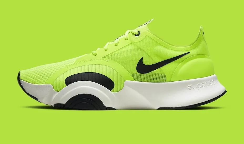
Team swag
Sneakers for everyone who shipped v2.

Launch party
Ice cream on the Lisbon office rooftop, Friday at six.
Outlined, flat and raised cards from the same component.
Outlined
A border, no shadow.
Flat
Elevation 0 on base-200.
Raised
Elevation 12.
With OnClick the card gets button semantics and answers Enter and Space.
Deploy to staging
Click or press Enter to deploy
Deployed 0 times
API
<Card>
DaisyBlazorParameters
- Elevation int= 1
Shadow depth from 0 (none) to 12+ (shadow-xl); defaults to 1 (shadow-sm). Ignored when Outlined.
- Outlined bool= false
When true, draws a card-border border instead of the elevation shadow.
- Class string= null
Extra CSS classes merged onto the root element.
- Style string= null
Inline CSS styles applied to the root element.
Events
- OnClick EventCallback<
MouseEventArgs> Raised when the card is clicked or activated by Enter/Space; also gives it button role and focusability.
Content
- ChildContent RenderFragment
Content rendered inside the .card surface.
<CardHeader>
DaisyBlazorParameters
- Class string= null
Extra CSS classes merged onto the root element.
- Style string= null
Inline CSS styles applied to the root element.
Content
- CardHeaderActions RenderFragment
Action buttons pushed to the end of the header.
- CardHeaderAvatar RenderFragment
Avatar slot rendered at the start of the header.
- CardHeaderContent RenderFragment
Title area rendered next to the avatar, filling the remaining width.
- ChildContent RenderFragment
Free content rendered after the avatar and content slots.
<CardContent>
DaisyBlazorParameters
- Class string= null
Extra CSS classes merged onto the root element.
- Style string= null
Inline CSS styles applied to the root element.
Content
- ChildContent RenderFragment
Content rendered inside the daisyUI card-body region.
<CardActions>
DaisyBlazorParameters
- Class string= null
Extra CSS classes merged onto the .card-actions element.
- Style string= null
Inline CSS styles applied to the .card-actions element.
Content
- ChildContent RenderFragment
Buttons or other actions rendered in the .card-actions footer.
From MudCard
Card keeps MudCard's parameter names, so most markup moves over by
dropping the Mud prefix. See the migration guide for the shared enums, icons and services.