Examples
The classic use: two versions of the same picture.
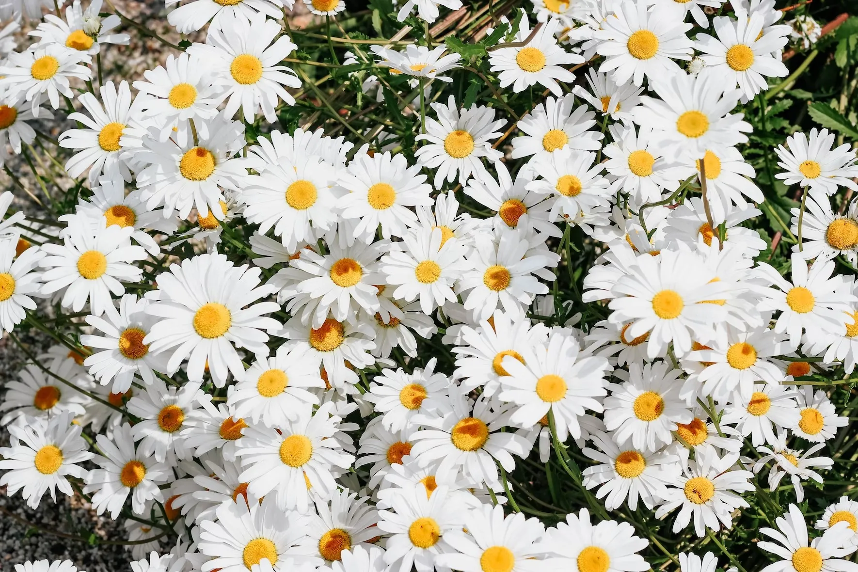

website/Examples/DataDisplay/DiffImagesExample.razor
Source
Panes can hold text or components: style the same word twice and drag to reveal it. AspectClass changes the ratio.
ACME
ACME
website/Examples/DataDisplay/DiffTextExample.razor
Source
API
<Diff>
DaisyBlazorParameters
- AspectClass string= "aspect-16/9"
Tailwind aspect-ratio utility applied to the root element (e.g. "aspect-16/9", "aspect-4/3", "aspect-square"). Defaults to "aspect-16/9".
- Item1Label string= null
Accessible name of the first pane; when set the pane is exposed as role="img".
- Item2Label string= null
Accessible name of the second pane; when set the pane is exposed as role="img".
- Class string= null
Additional CSS classes merged onto the diff container.
- Style string= null
Inline styles applied to the diff container.
Content
- Item1 RenderFragment
Content rendered in the first (left/bottom) diff pane.
- Item2 RenderFragment
Content rendered in the second (right/top) diff pane.